3 PSD | 3000x2008 PIX | 114 MB

6 JPG | 3600x3600 PX | 82,0 MB
2 PSD | 2000x1333 PIX | 37.7 MB


7 JPG | 3600x3600 PX | 112 MB

5 JPG, 1 PNG | 3600x3600 PX | 87,0 MB

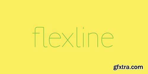
Flexline is originally a hairline typeface that can be bolded with its own stroke according to the user’s needs. When using a hairline font, which normally don't have a wide range of widths, people tend to stroke it looking for a more eye-catching advertisment or to emphasize a word in a text. The difficulty is that most typefaces are not designed to be stroked and in doing so people commit typographic crimes. This is not the case with Flexline. Flexline is a font created to be widened through its stroke. This happens thanks to its rounded endings, its great x-height and subtle unions that neither disappear nor become more pronounced.
OTF | 1 Font | JPEG Preview | 1.7 Mb RAR
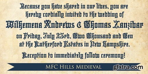
MFC Hills Medieval was developed from a unique historical Blackletter type specimen in the 1882 Hills Manual of Social and Business Forms. While you could use its ornate capitals to construct a monogram, this is not a monogram font, but a fully functional typeface for invitations and period lettering. From stylish and ornate capitals to a soft lowercase resembling bled ink, this period lettering style is a true eye-catcher. Because of some of the unique medieval letterforms, standardized letterforms were created as the default typeable letters while the true historical forms were setup as Stylistic Alternates. A sophisticated Blackletter for manuscripts and invitations alike.
OTF | 1 Font | JPEG Preview | 1 Mb RAR
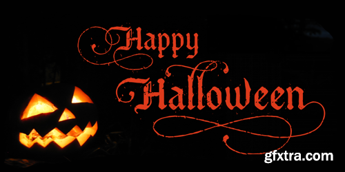
Bucanera Corradine Font Family
Bucanera Antiqued is the black ship of Bucanera’s family, sure you will use it in any dark or dirty project. Try the Open Type version to reach its numerous swashes, flourished and alternate characters.
OTF | 3 Fonts | JPEG Preview | 1.5 Mb RAR
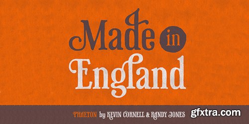


Knud V. Engelhardt (1882–1931) was an architect, printer and designer from the country of our laid back neighbours, Denmark. Knud’s characteristic letter forms have already made a strong impression on some modern typefaces. Most notably is probably Skilt Gothic by a fellow Swedish compatriot, where Knuds way of trimming the diagonal stems is one of the spices used to give the typeface its character. Fighting against the desire to make something similar, this new typeface instead takes the concept to a whole new level by trimming not only diagonals, but all possible letters! The result is something – different. Trim comes in a large family including manually hinted webfonts and high quality desktop fonts. Some are fat, some are skinny and some are just lagom. This is the monospaced version of Trim.
TTF | 5 Fonts | JPEG Preview | 1 Mb RAR

SermonBox - Seasonal Collection

SermonBox - The Series Pack Collection

Top Rated News


Would you like to be a Author?